

Analytics is restricted to workspace administrators. Open it from Analytics in the Admin Dashboard sidebar.
Set the scope first
The date range under the page title and the filter bar above the tabs govern everything below them, and both survive a tab switch.- Date range: the button under the page title shows the current window. Open it for four presets (Last 7 days, Last 30 days, Last 90 days, Last 12 months), or pick a custom range on the calendar and press Save. A preset applies as soon as you click it.
- Granularity: Day, Week, or Month, defaulting to Week. This sets the bucket for every chart at once.
- All teams, All users, and All apps: multi-selects that narrow the page to specific departments, people, or workflows. The App filter appears on Overview and AI Apps only.
Active this period, the Active users chart, and the Usage heatmap always count all activity for the selected teams and people, whichever App filter is set. Those three answer whether a person is using VirtualBrain at all, so an App filter would defeat the question.
Overview
Overview is where you check the deployment’s health before going after detail.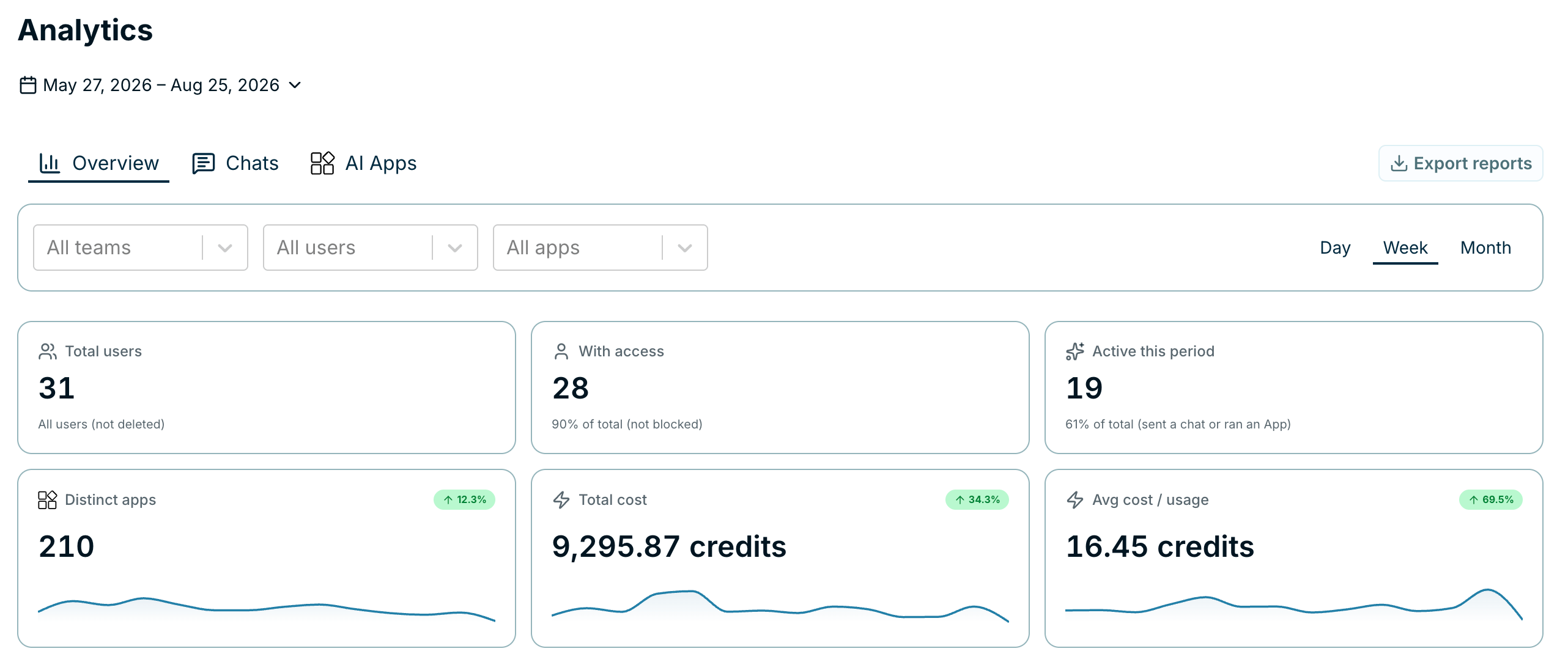
The Overview tab: the user funnel on top, cost and reach below, each with its trend.
Chats
The Chats tab breaks chat message volume down by person over time, so you can see who has adopted Chat and who hasn’t.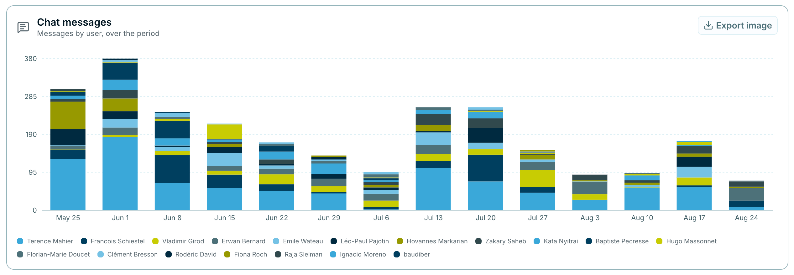
Chat messages by user, stacked over the period.
AI Apps
The AI Apps tab covers what your workflows cost and who runs them.- Sessions by App and Sessions by user chart run volume over the period, stacked two ways.
- By App ranks every App by Sessions, with Total cost, Distinct users, and Avg cost / session alongside, so you can see whether a workflow justifies the credits it consumes.
- Apps by user ranks people by Sessions, with Distinct apps and Total cost, and an Apps used column tagging each person’s App mix, busiest App first. Click +N on a row to see the Apps that didn’t fit.
- Sessions is the session-level record: date, App, session title, user, and credit cost for every run in the period. Search it by App, session title, or user to pull up the individual runs behind a number above.
Export reports
Export reports, at the right of the tab strip, exports the tab you’re on. Every report starts selected, so clear the ones you don’t want. Pick one and it downloads as that file; pick several and they arrive as a single zip named for the tab and the date range.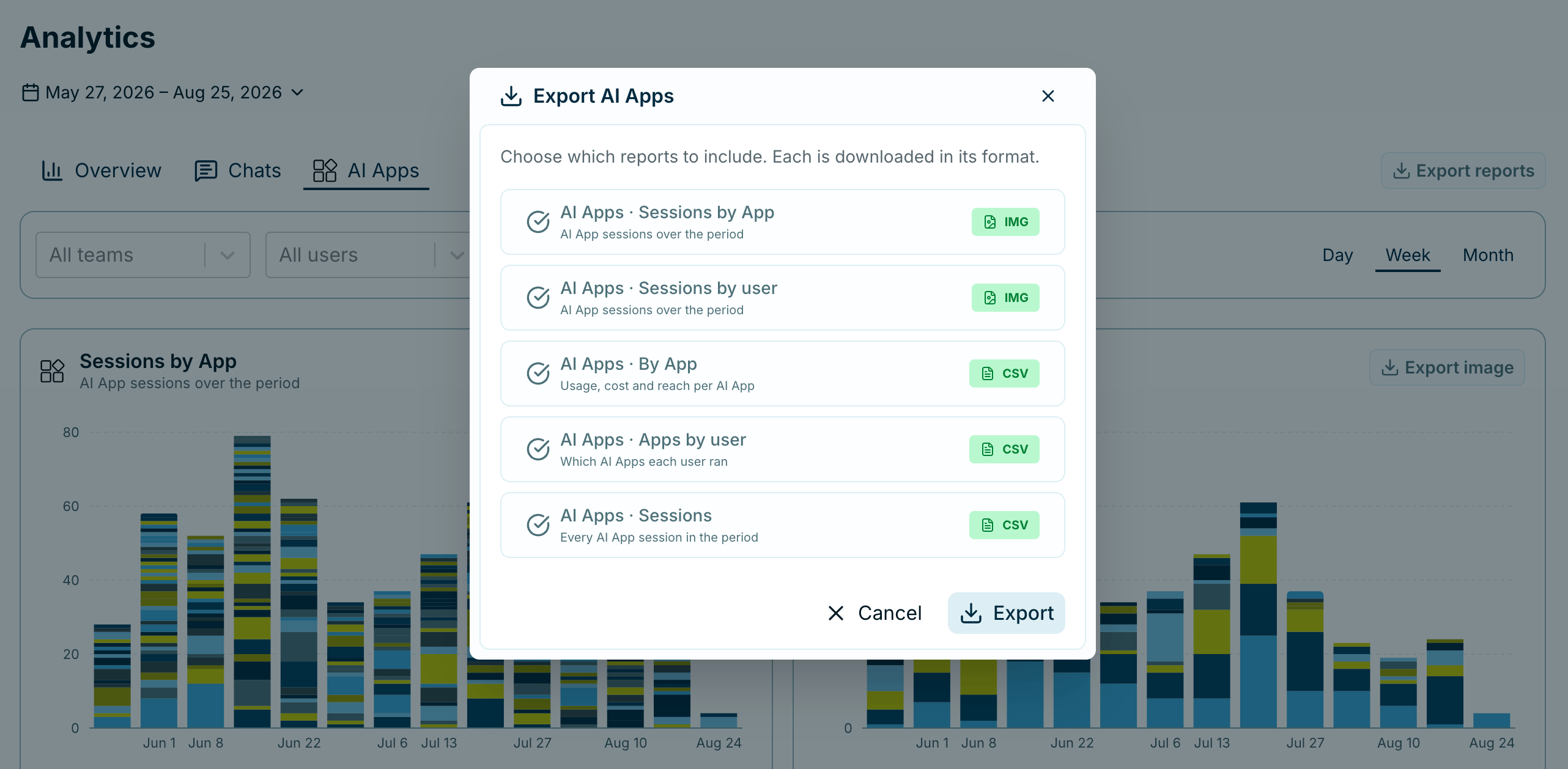
Export reports on the AI Apps tab: pick the reports you need, charts as images and data as CSV.
Every export carries the filters and date range you set, and the filename records them, so
by_app_2026-04-21_2026-07-20.csv still describes itself three months later. Individual cards also carry their own button when a single item is all you need: Export image on each chart, Export CSV on each table. A table’s CSV holds every row, not only the page on screen.
How the numbers are defined
Active this period
Active this period
A user who sent a chat message or ran an App within the selected date range. Logging in without doing either doesn’t count. A session counts in the period of its last message, so a run that spans midnight lands on the second day.
With access
With access
Everyone provisioned as of the end of the period who is neither blocked nor deleted. Blocking or deleting someone in Teams & Users removes them from this count and from Total users, while their messages, sessions, and credits stay in every other figure on the page.
Credits
Credits
The consumption unit for AI App sessions. Chat messages consume no credits and contribute nothing to the cost figures. Total cost is the credits your App sessions consumed in the period, and avg cost / usage divides that by the number of App sessions, which is the figure to watch when a workflow gets more expensive per run.
The change figures
The change figures
The three cost and reach cards compare against the immediately preceding window of the same length, with the same filters applied. On a 30-day range, the comparison is the 30 days before it, so the figure tracks momentum rather than a fixed month boundary. The three funnel cards carry no comparison.
What the charts label, and what they leave out
What the charts label, and what they leave out
Stacked charts draw a segment for every person or App with activity, so nothing is missing from the totals. What’s capped is the labelling: the legend names the first 24 series and adds and N more, and a bar’s tooltip lists the 20 largest contributors for that period. Segment colours repeat after eight series, so identify people from the tooltip or the table rather than by colour.
Tables and their totals
Tables and their totals
Tables show 20 rows a page, and list only the users or Apps with activity in the period. In the Total row, distinct counts (Distinct apps, Distinct users) are company-wide figures for the window rather than the sum of the column above, so they read lower than the numbers stacked over them.
Related
Teams & Users
The people and teams behind the numbers, and where you block or restore access.
Apps Overview
What App sessions are and how teams run them.
Admin Dashboard
The other firm-wide controls: prompts, integrations policy, and slide templates.